Brand Designer & Copywriter
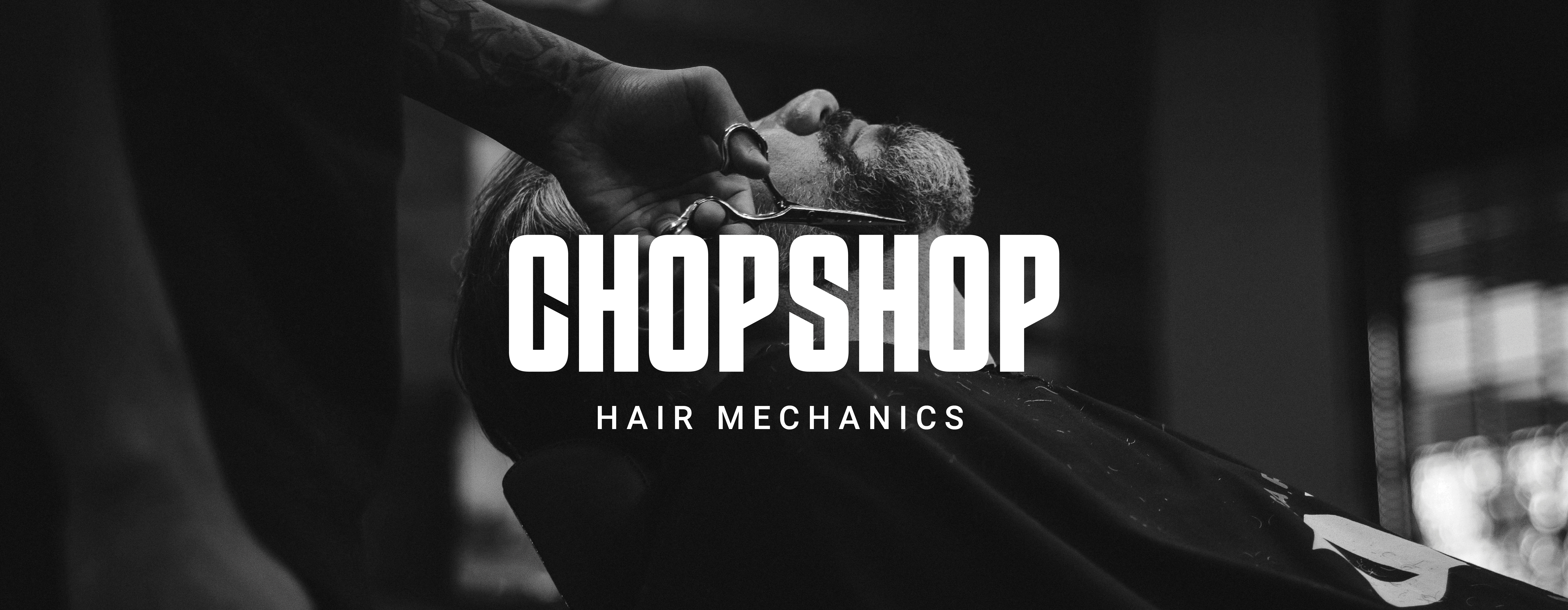
The life-long dream of Martin Prihoda, a celebrity photographer
& avid biker, Chopshop is a boutique, biker-themed barbershop based in Goa, India. Besides alluding to a place where one might get their hair cut, the name 'Chopshop' also pays homage to motorcycle culture where mechanics would 'chop' up bikes to modify them. Aimed at the urban man determined to live out his mid-life crisis with swag, Chopshop is where he goes when he's looking to feel his best.
Identity Design
Branding System
Packaging


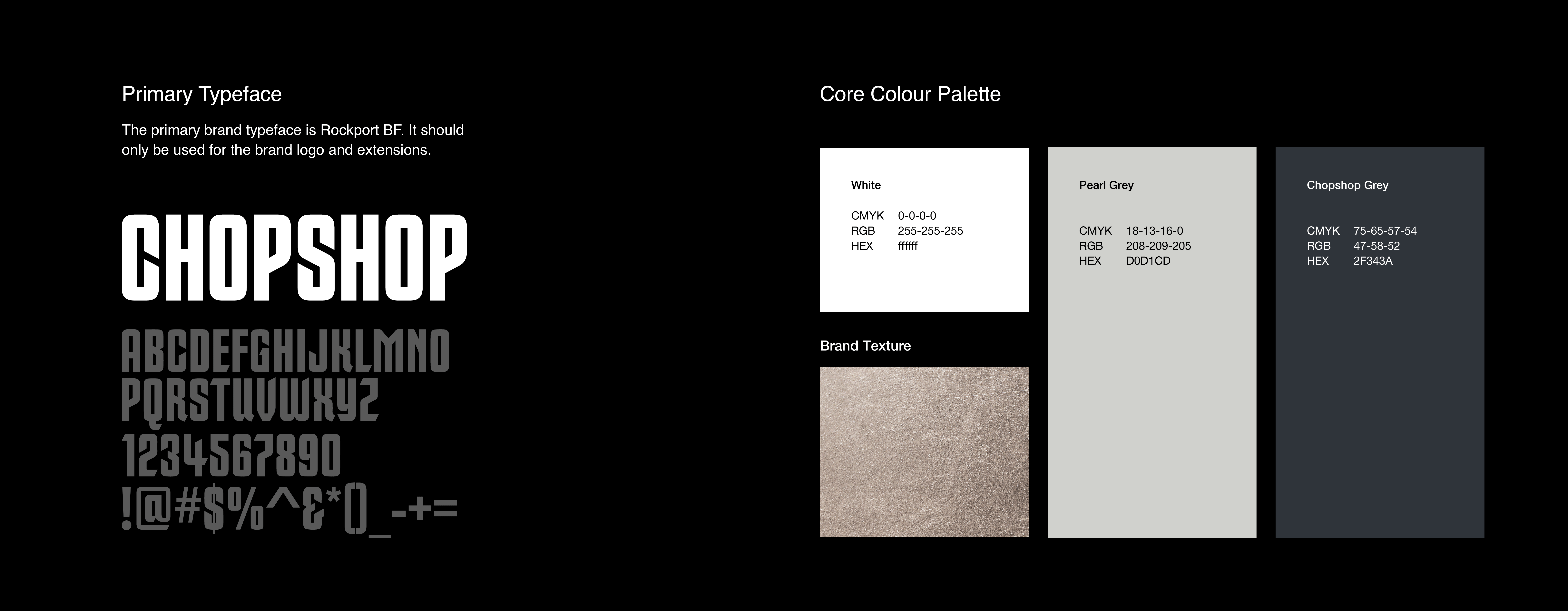
The letter forms of the clean, streamlined logotype reference their founder's calling by featuring chopped edges, angled at 28 degrees. The characters of the logotype also sppear in the brand pattern, aranged to create an aerial view of a city. The appearance of city streets is visible in the negative space of the letters whilst the glyphs themselves resemble buildings or blocks.


CLIENT
CATEGORY
CREDITS
Anisa Shaikh - designer & copywriter
Ranjana Dani - design mentor, MIT-ADT University
Priyanka Bhasin - design mentor, Design Stack
FEATURES
Featured in World Brand Design Society 2019