Brand Designer & Copywriter

Sporting the well-earned title of 'superfood specialists', Nourish You is a 2015-born Indian brand that seeks to nourish its customers, associated farmers and the planet too. Having nurtured its tribe steadily since its inception, in 2023 the brand aimed to establish its unique combination of integrity & quality in hubs across the nation. With this in mind, Nourish You embarked upon a journey to redesign its logo, visual language, packaging and communication strategy.
Logo Design
Packaging
Brand Personality
Brand Communication Strategy & key content


In order to help Nourish You achieve its goal of better supporting and expanding its loyal community, we consolidated the brand's overall communication strategy by building out key brand personality & value dimensions, core pillars of the brand, consumer profiles and more.


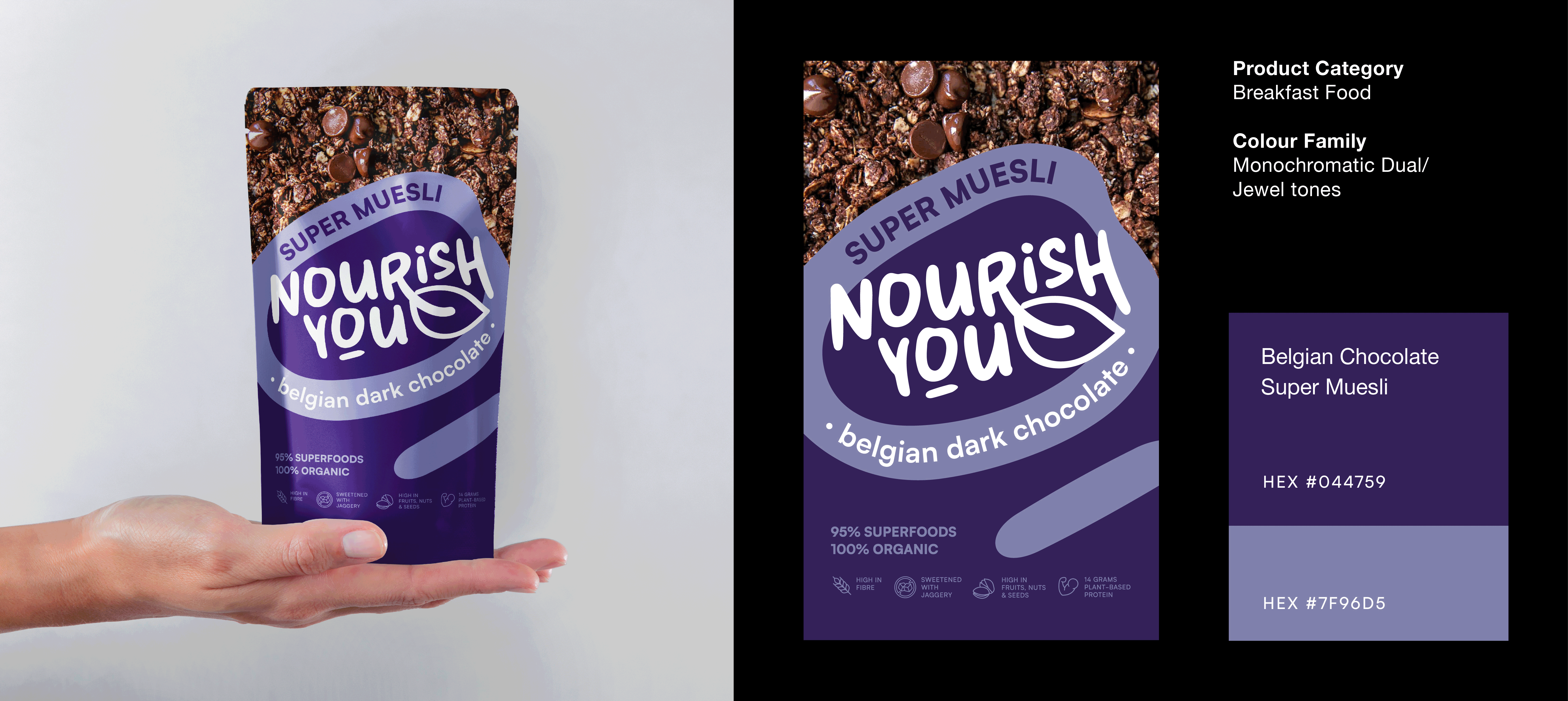
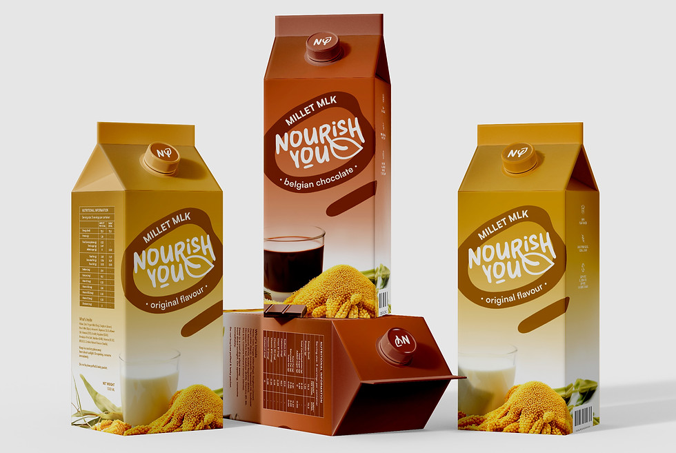
A large & varied portfolio of superfood & smartfood-based products meant that each category of comestibles needed to possess its own sense of individualism within the overarching visual language. While the logo-styling, dual monochromatic colour scheme and an emphasis on simple vector elements remains consistent across the board, each product group also sets itself apart in one or two key ways.
PRODUCT RANGE
Breakfast Cereal

PRODUCT RANGE
Super seeds


PRODUCT RANGE
Plant-based Milk

CLIENT
Nourish You (superfood-driven comestibles)
CATEGORY
Freelance Project
(Unpublished 2023)
CREDITS
Anisa Shaikh - designer & copywriter
Anu Patel - designer & project manager